Corporate Customers Brochure
the
client

the
solutions


the
brief
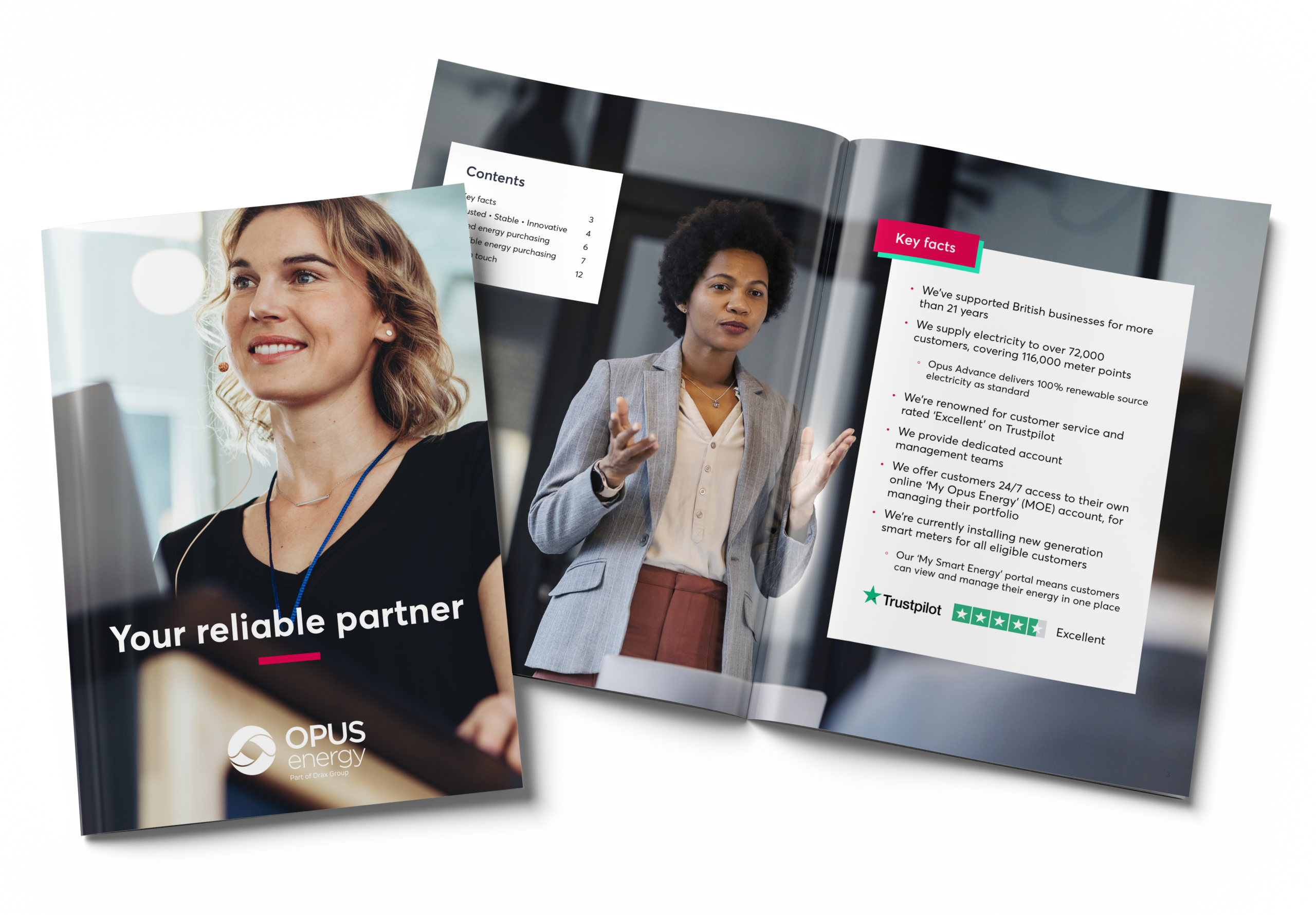
To coincide with the relaunching of our corporate sales activity the Business Development Managers asked us for an up to date product brochure.
Currently, the team have no collateral to bring to potential TPIs to help sell Opus and its products.
The brochure will cover all Opus products and also features a high level introduction to Opus and our relationship with Drax.
The copy needs to be consistent in tone of voice and information displayed.
the
solution
Opus energy guidelines focused on the blue and magenta colours. For this design, I worked on the principle of 60% to 30% blue to magenta or magenta to blue with up to 10% of the mint colour per spread (and balancing with their tertiary colours).
They wanted something that moved away from the more corporate look and feel that they were currently favouring in place they wanted something with more interesting imagery that displayed their copy better.